Product Design
Payment Portal for Hospital Network Concept
Project Scope
Deliverables
User flow, wireframe, and interactive prototype
Goals
Create payment portal concept for a hospital that demonstrates how users can pay their medical bills.
Problem Statement
Inspired by a design challenge to create a payment portal for a hospital in Los Angeles, CA. I researched multiple hospital networks and found the Cedars Sinai payment portal could use an improved UI experience so that users can pay their medical bills to the hospital network.
For this project, I chose to start with the mobile design. This is because many more people have access to browse the web from their phones, and optimizing for a mobile-first experience is the most accessible for users.
Design process
To get an idea of the experience of making a payment for a hospital, I explored Cedar's Sinai Quick Pay option. I took note of the following areas of improvement could use a cleaner, more modern user interface and more accessible use for fonts, colors, and layout.
Cedar's Sinai uses MyChart by Epic for its payment portal. Therefore, since I did not have an account with them, I used my local hospital network, Norton Healthcare in Louisville, KY, to research and evaluate the different screens a user would need to encounter to pay their medical bill.
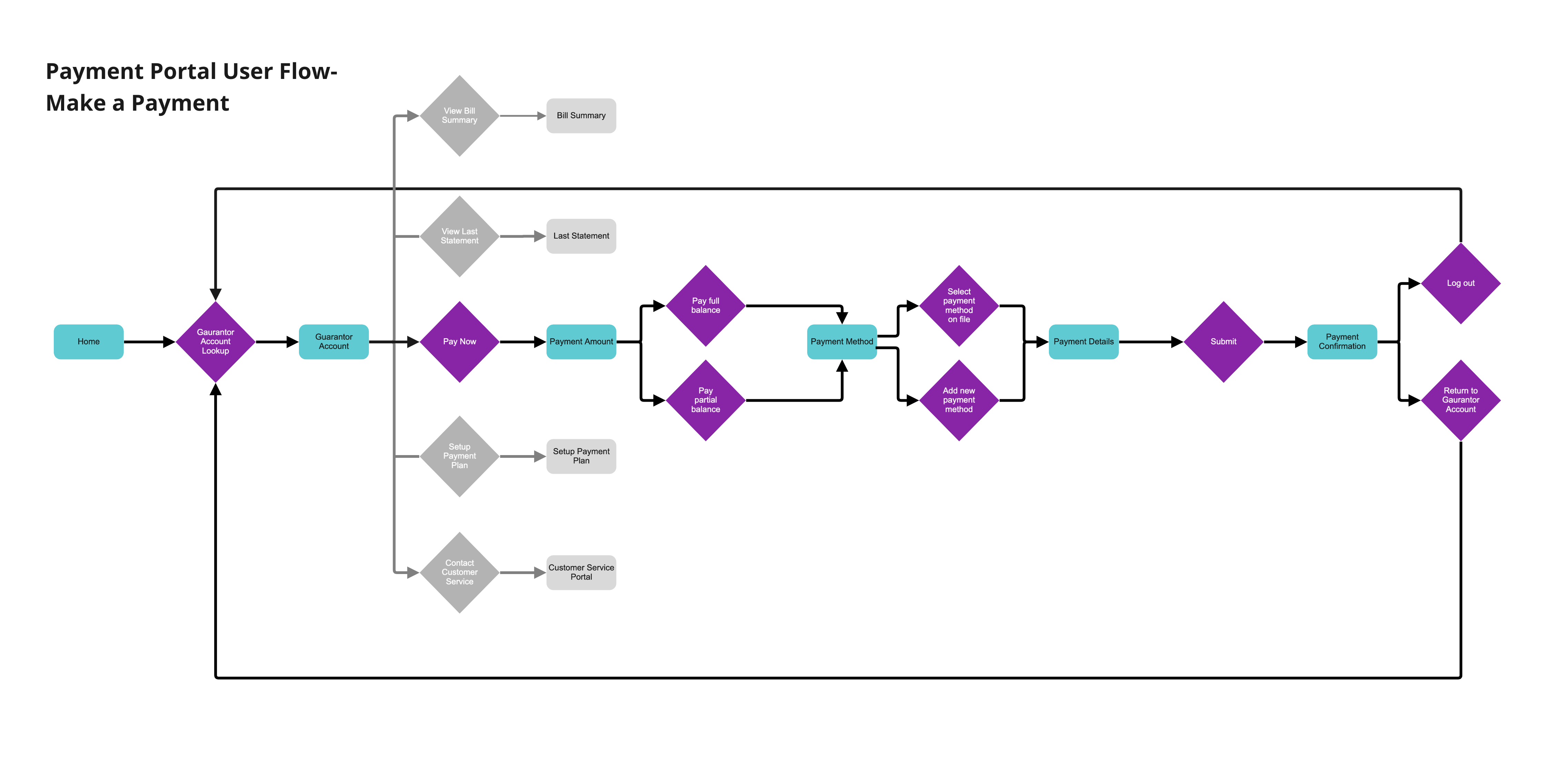
User Flow
After evaluating the screens from MyChart, I used Miro to create a user flow for a user that wants to submit payment for a medical bill on their account.
Low Fidelity Wireframe
Once I created the user flow submitting a payment, I used Miro's wireframing tools to create a low-fidelity wireframe. I like this approach because it allows you to drag and drop various UI components and is great for collaboration with other designers, engineers, and teammates.
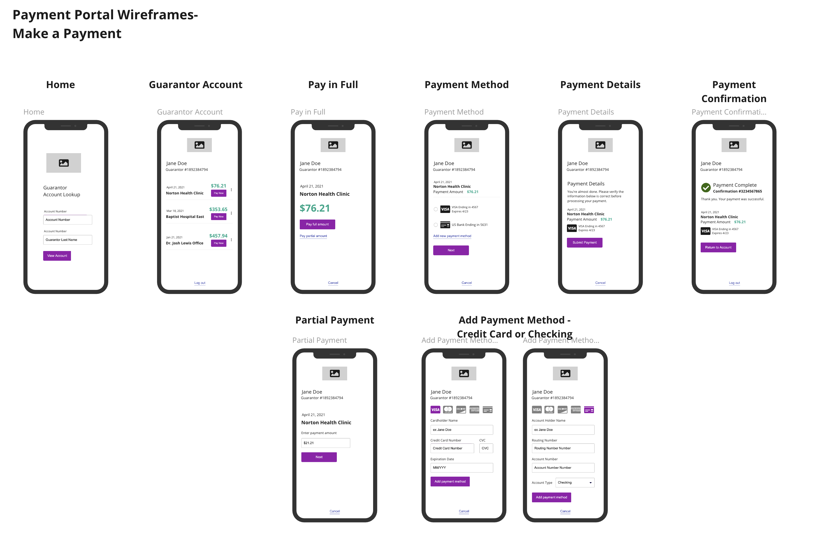 View User Flow and Wireframe in Miro
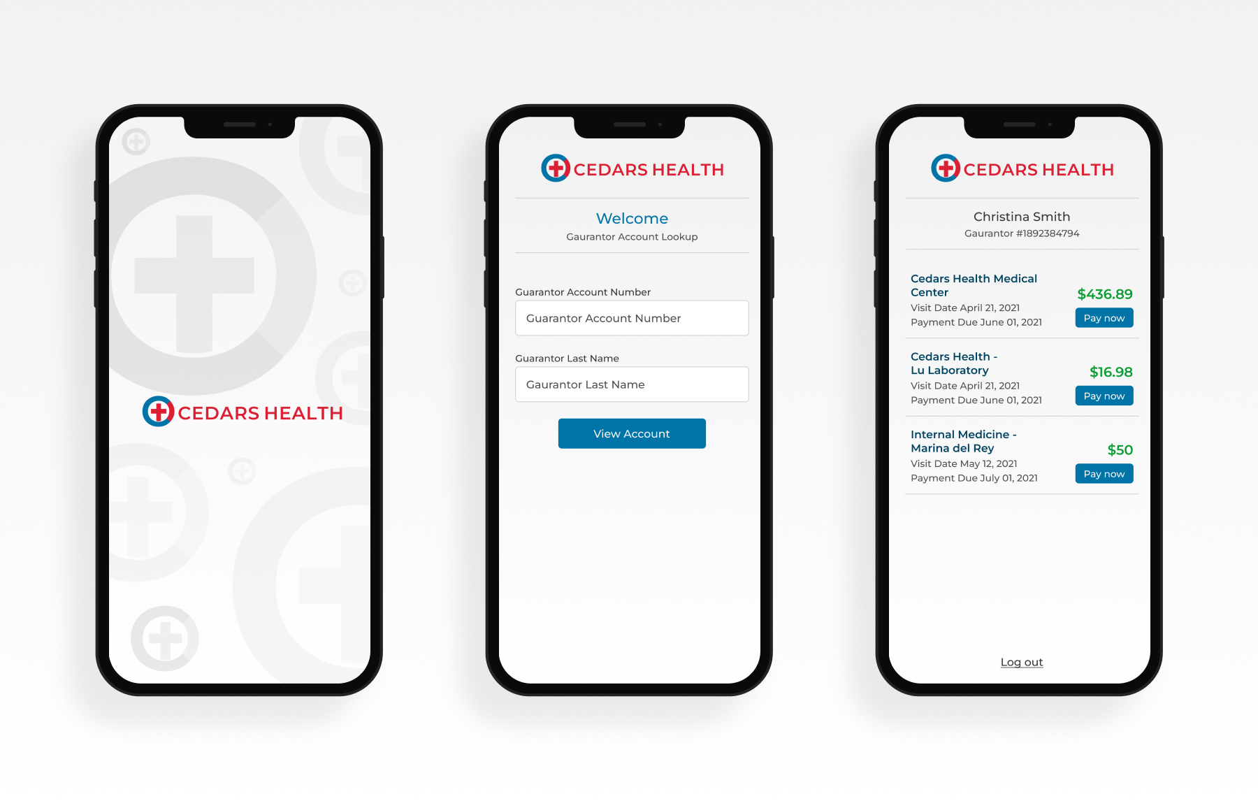
Interactive Prototype
With the initial design concept and userflow established, I went to work creating an interactive prototype in Figma. I made some additional improvements of the user interface and fleshed out the flow even further.
User Feedback
After sharing the first prototype with a few users, I learned the following:
- Some users did not understand what a guarantor was.
- Users wanted to know more billing information. For example, who was the provider, what address, and what services or charges were on the bill.
- Some users felt that the text was too close together.
- Some users felt the check icon looked like a credit card.
- Some users wanted the ability to change the amount or payment method throughout the payment process.
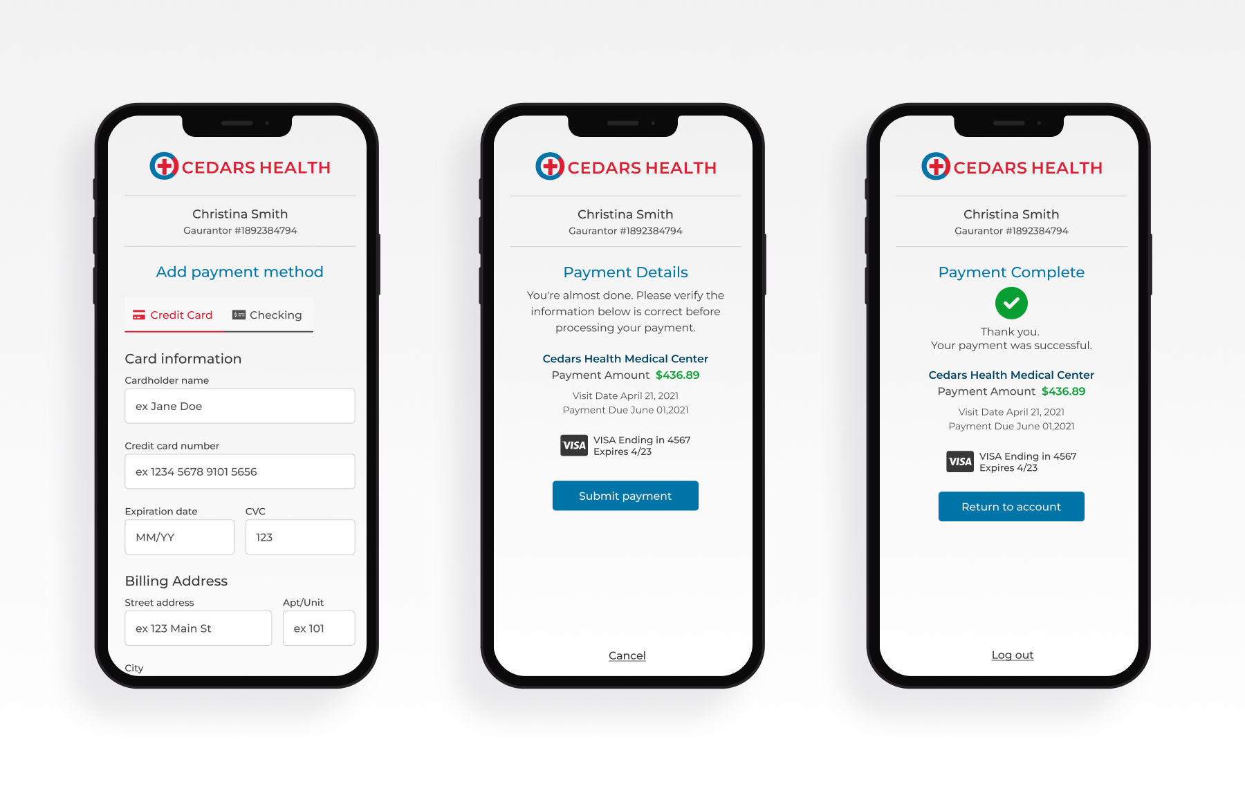
High Fidelity Design and Prototype
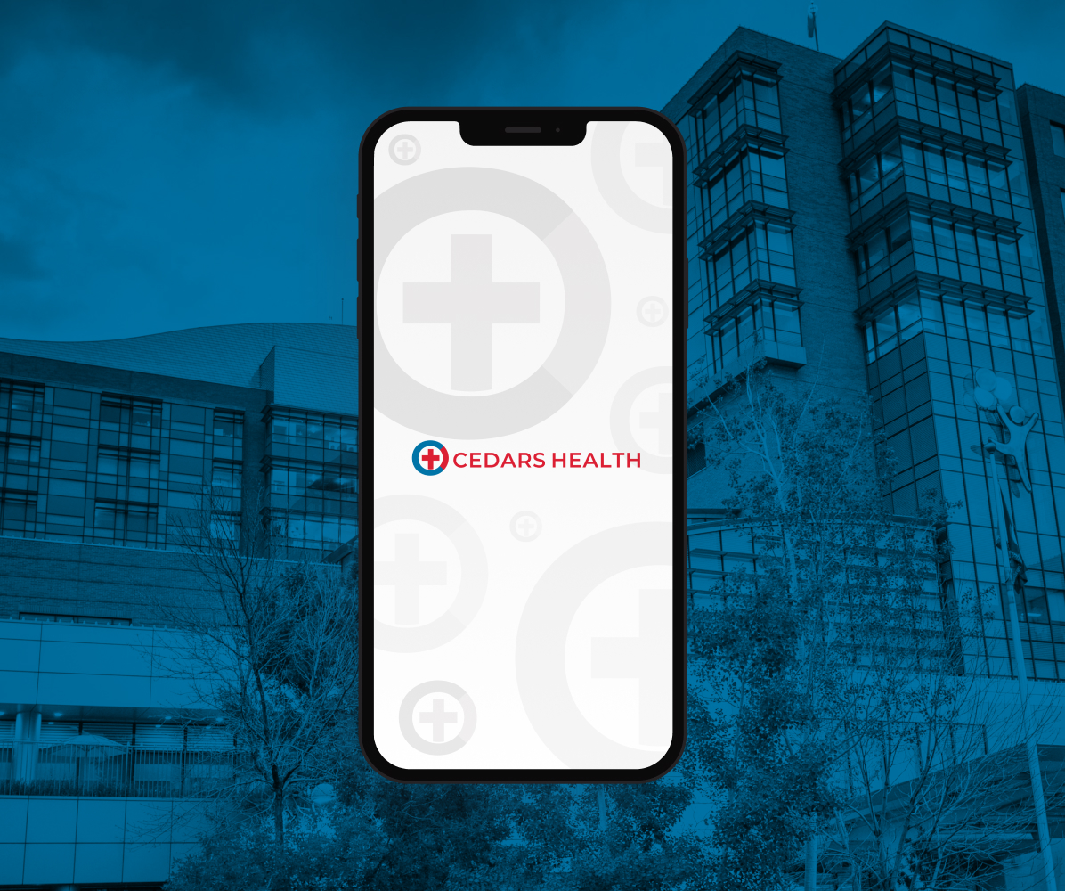
I began working on a more polished look for the app. I started by creating a logo and named the project Cedars Health. The color palette is simple, red, and blue since it relates to medical care.
I made adjustments to the typography, alignment, and spacing throughout the design based on user feedback. I also updated the icons per user feedback, so the check and credit cards don't look similar. Also, I added the ability to click on the payment amount and the credit card to go back to edit those options before submitting a payment. Feedback such as more billing details can be added when working on the View Bill Summary and View Last Statement user flow.
Finally, I added a launch screen and an app loading animation to make the app look and behave more realistically.
 Figma Prototype
Next Steps
This case study is still a work-in-progress; below are some next steps for this application.
- Improve the transitions between the screens with more animation.
- Explore adding potential solutions for viewing a bill summary, viewing and downloading a statement, setting up a payment plan, and contacting customer service.